Show the code
# Load libraries
library(tidyverse) # Data wrangling and plots
library(here) # File control in project
# Load the cleaned soldiers dataset
source(here("scripts", "01_import.R"))Steen Flammild Harsted & Søren O´Neill
February 2, 2026
You can download the course slides for this section here

source(here("scripts", "01_import.R")) in the chunkYou’ll need to guess a little because you haven’t seen all the datasets and functions yet, but use your common sense! See if you can predict what each plot will look like before running the code.
Use the mpg dataset.
mpg datasetUse one or more of: ?mpg, head(), glimpse() and/or summary()
colour, shape, and size aesthetics.Use this basic code, and add/change the colour, shape, and size aesthetics.
## Examples
# Categorial
ggplot(mpg, aes(cty, hwy, colour = class)) +
geom_point()
# Continuous
ggplot(mpg, aes(cty, hwy, size = displ)) +
geom_point()
# Continuous
ggplot(mpg, aes(cty, hwy, color = hwy)) + # Notice hwy is mapped to both y axis and color
geom_point()
## A continuous variable doesn't work for shape
ggplot(mpg, aes(cty, hwy, shape = displ)) +
geom_point()
# Multiple Categorical - a legend for each aesthetic is created
ggplot(mpg, aes(cty, hwy, colour = class, shape = fl)) +
geom_point()geom_point() and geom_smooth()soldiers dataset
Explore the relationship between heightcm and weightkg using geom_point()
BMI
category
Explore the relationship between heightcm and weightkg using geom_point() and geom_smooth()
sex
facet_wrap()scales argument in facet_wrap() do? When might you use it?
Explore the relationship between heightcm and weightkg
geom_point() and geom_smooth()sexcategorygeom_bar()geom_bar() to explore how many soldiers of each race there is
geom_bar() to explore how many soldiers are at each Installation
fill aestetic to color the Installation bars according to race
geom_boxplot()geom_boxplot to explore weightkg across the different Installations
alpha) to avoid overplotting
* Use facet_wrap() to split on sex have the plots placed in one column
sets_for_vis_exercise.csv file sets_for_vis_exercise.csvsets_for_vis_exercise.csv file in your raw_data folder.sets_for_vis_exercise.csv and assign it to an object called setsAbout the data:
The data contains x and y coordinates for 13 sets. For learning purposes we have obscured the names of these sets.
The data comes from the jumpingrivers GitHub repository. Once you have completed the exercise you can read more about the data here.
dplyr recapFor each set calculate:
xyxyx and ysets using your new found visualization skills
labs()What can we control with this function?
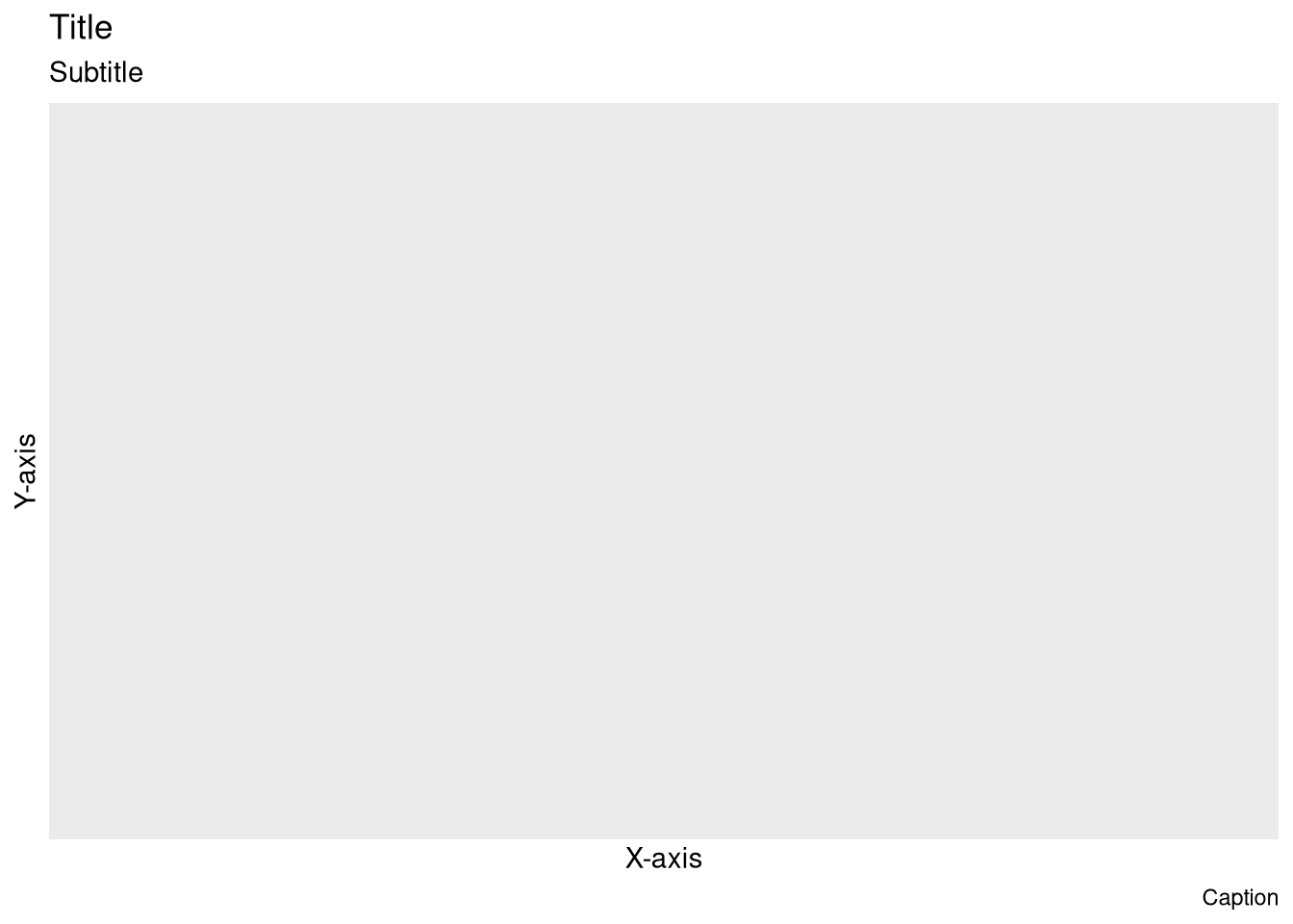
labs() and recreate this plotTo create a completely blank plot just type ggplot()
ggplot(mpg, aes(hwy, cty))+ geom_point()theme_ and try some of the suggestions.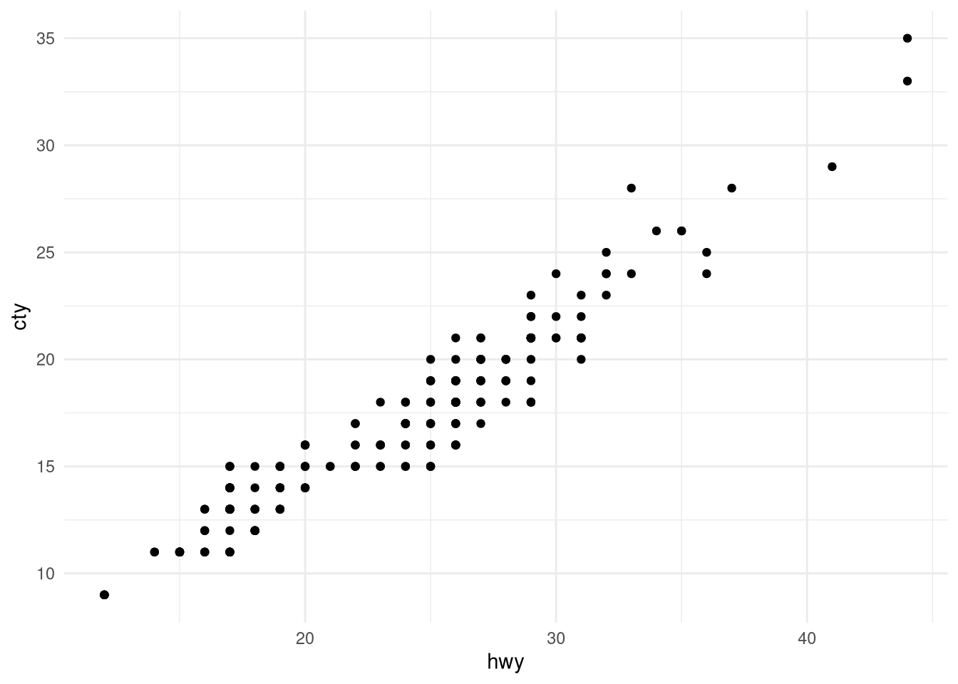
Use install.packages() to download the ggthemes package. When you have done that add library(ggthemes) to the code chunk where you call your libraries and execute the line.
Watch the gallery
In your project folder, create a new folder for saving plots and/or tables (e.g. “plots”)
ggsave()ggsave()diamonds, recreate the R code necessary to generate the following graphs.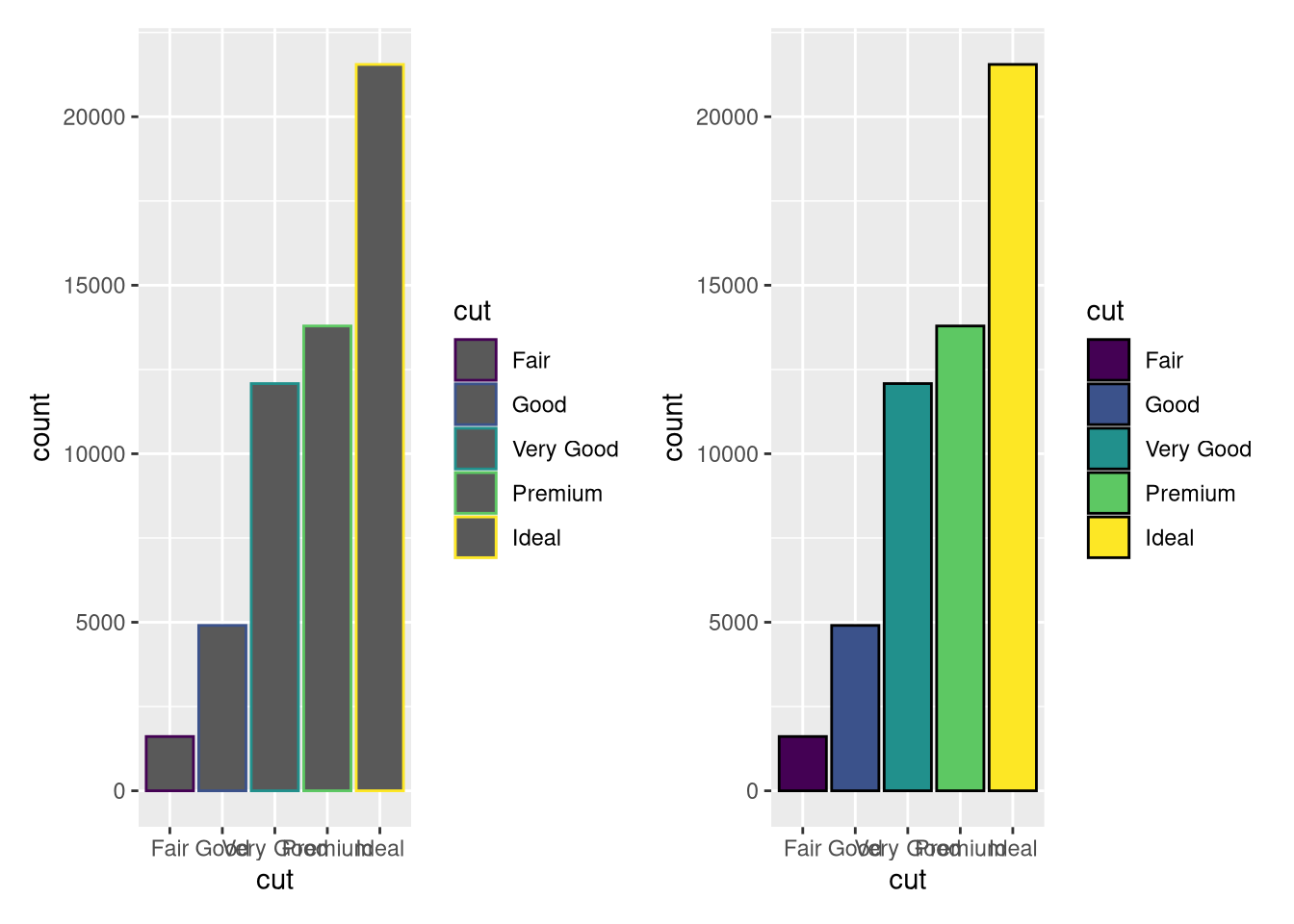
diamonds, recreate the R code necessary to generate the following graph.
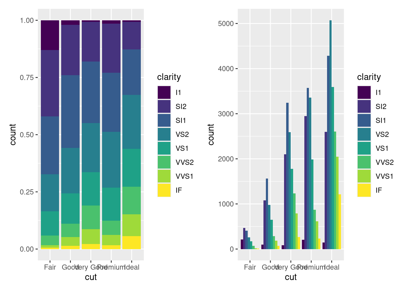
diamonds, recreate the R code necessary to generate the following graphs.position=?????

patchwork packagelibrary(patchwork) to the code chunk where you call your libraries and execute the line.patchworkis not installed on your machine. Type install.packages("patchwork") in the console. This line should not be included in the “ggplot.qmd” file.p <- ggplot(diamonds)
pf <- ggplot(diamonds |> filter(carat<3))
p1 <- p + geom_bar(aes(x = cut, fill = clarity), position = "fill") +labs(title = "p1")
p2 <- p + geom_bar(aes(x = cut, fill = clarity)) +labs(title = "p2")
p3 <- pf + geom_histogram(aes(x = carat, fill = clarity), binwidth = 0.1, position = "fill", na.rm = TRUE) +labs(title = "p3")
p4 <- pf + geom_histogram(aes(x = carat, fill = clarity), binwidth = 0.1, position = "dodge", na.rm = TRUE) +labs(title = "p4")
plot_annotation()tag_levels = 'A' do?& symbol to do this the smart waylabs() functionlabs() function to NULLtheme_void() and the viridis magma fill scale---
title: "ggplot2"
author: "Steen Flammild Harsted & Søren O´Neill"
date: today
format:
html:
toc: true
toc-depth: 2
number-sections: true
number-depth: 2
code-fold: true
code-summary: "Show the code"
code-tools: true
execute:
eval: false
message: false
warning: false
---
<br><br>
# Presentation
You can download the course slides for this section <a href="./presentation_ggplot2.html" download>here</a>
<div>
```{=html}
<iframe class="slide-deck" src="presentation_ggplot2.html" width=90% ></iframe>
```
</div>
```{r load-packages}
#| eval: true
#| include: false
library(tidyverse)
library(here)
library(patchwork)
sets <- read_csv(here("raw_data", "sets_for_vis_exercise.csv"))
```
```{r}
#| eval: true
#| column: margin
#| echo: false
knitr::include_graphics(here::here("img", "sherif.png"))
```
## Getting Started {.unnumbered}
* Create a new quarto document and name it "ggplot.qmd"
* Change the YAML header to style your document output. (see YAML example below)
* Insert a code chunk and load 2 important libraries
* Insert a new code chunk- Write `source(here("scripts", "01_import.R"))` in the chunk
* Discuss what the code does and run it
* Write a short headline to each code chunk
::: {.callout-tip collapse="true"}
### YAML example
````{verbatim}
---
title: "TITLE"
subtitle: "SUBTITLE"
author: "ME"
date: today
format:
  html:
    toc: true
    toc-depth: 2
    embed-resources: true
    number-sections: true
    number-depth: 2
    code-fold: true
    code-summary: "Show the code"
    code-tools: true
execute:
  message: false
  warning: false
---
````
:::
```{r}
#| eval: true
# Load libraries
library(tidyverse)  # Data wrangling and plots
library(here)       # File control in project

# Load the cleaned soldiers dataset
source(here("scripts", "01_import.R"))
```
<br>
## Guess the output
#### Discuss the code below.
You’ll need to guess a little because you haven’t seen all the datasets and functions yet, but use your common sense! See if you can predict what each plot will look like before running the code.
```{r}
#| code-fold: false
ggplot(mpg, aes(cty, hwy)) + geom_point()

ggplot(diamonds, aes(carat, price)) + geom_point()

ggplot(economics, aes(date, unemploy)) + geom_line()

ggplot(mpg, aes(cty)) + geom_histogram()
```
<br>
## Aesthetic mappings - aes()
Use the `mpg` dataset.
<br>
### Explore the columntypes in the `mpg` dataset
Use one or more of: `?mpg`, `head()`, `glimpse()` and/or `summary()`
```{r}
mpg |>  head()
mpg |>  glimpse()
mpg |>  summary()  # or library(skimr) and then mpg |> skim()
```
<br>
### Experiment with the `colour`, `shape`, and `size` aesthetics.
Use this basic code, and add/change the `colour`, `shape`, and `size` aesthetics.
```{r}
#| code-fold: false
#| eval: true
ggplot(mpg, aes(cty, hwy)) +
  geom_point()
```
* What happens when you map continuous variables to one or more of the aesthetics?
* What about categorical variables?
* What happens when you use multiple aesthetics in a plot?
```{r}
## Examples

# Categorial
ggplot(mpg, aes(cty, hwy, colour = class)) +
  geom_point()

# Continuous
ggplot(mpg, aes(cty, hwy, size = displ)) +
  geom_point()

# Continuous
ggplot(mpg, aes(cty, hwy, color = hwy)) +  # Notice hwy is mapped to both y axis and color
  geom_point()

## A continuous variable doesn't work for shape
ggplot(mpg, aes(cty, hwy, shape = displ)) +
  geom_point()

# Multiple Categorical - a legend for each aesthetic is created
ggplot(mpg, aes(cty, hwy, colour = class, shape = fl)) +
  geom_point()
```
<br>
### What’s gone wrong with this code? Why are the points not blue?
```{r}
#| code-fold: false
ggplot(data = mpg) +
  geom_point(mapping = aes(x = displ, y = hwy, color = "blue"))
```
```{r}
# If you want all the points to be colored blue, then color = "blue" must be placed outside the aes() function.
ggplot(data = mpg) +
  geom_point(mapping = aes(x = displ, y = hwy),
             color = "blue")
```
<br>
## `geom_point()` and `geom_smooth()`
#### Use your `soldiers` dataset
\
Explore the relationship between `heightcm` and `weightkg` using `geom_point()`
```{r}
soldiers |>
  ggplot(aes(x = heightcm, y = weightkg))+
  geom_point()
```
\
* Color the points according to `BMI`
```{r}
soldiers |>
  ggplot(aes(x = heightcm, y = weightkg, color = BMI))+
  geom_point()
```
\
* Color the points according to `category`
```{r}
soldiers |>
  ggplot(aes(x = heightcm, y = weightkg, color = category))+
  geom_point()
```
\
Explore the relationship between `heightcm` and `weightkg` using `geom_point()` and `geom_smooth()`
```{r}
soldiers |>
  ggplot(aes(x = heightcm, y = weightkg))+
  geom_point()+
  geom_smooth(method = "lm")
```
\
* color by `sex`
```{r}
soldiers |>
  ggplot(aes(x = heightcm, y = weightkg, color = sex))+
  geom_point()+
  geom_smooth(method = "lm")
```
\
## `facet_wrap()`
* What arguments can you use to control how many rows and columns appear in the output?
* What does the `scales` argument in `facet_wrap()` do? When might you use it?
\
Explore the relationship between `heightcm` and `weightkg`
* Use `geom_point()` and `geom_smooth()`
* facet by `sex`
* color the points by `category`
```{r}
soldiers |>
  ggplot(aes(x = heightcm, y = weightkg))+
  geom_point(aes(color = category))+
  geom_smooth(method = "lm")+
  facet_wrap(~sex)
```
<br>
## `geom_bar()`
<br>
#### Use `geom_bar()` to explore how many soldiers of each `race` there is
```{r}
soldiers |>
  ggplot(aes(x = race))+
  geom_bar()
```
\
#### Use `geom_bar()` to explore how many soldiers are at each `Installation`
```{r}
soldiers |>
  ggplot(aes(x = Installation))+
  geom_bar()

# OR - Whats the difference?

soldiers |>
  ggplot(aes(y = Installation))+
  geom_bar()
```
\
* Use the `fill` aestetic to color the `Installation` bars according to race
```{r}
soldiers |>
  ggplot(aes(y = Installation, fill = race))+
  geom_bar()
```
\
* Change something so that you can visually evaluate if race is equally distributed across the Installations
```{r}
soldiers |>
  ggplot(aes(y = Installation, fill = race))+
  geom_bar(position = "fill",   #  All bars have full length/height - this makes it easier to see proportional differences between groups
           color = "black"      #  Adds a black line around each box.
           )
```
\
## `geom_boxplot()`
<br>
#### Use `geom_boxplot` to explore `weightkg` across the different Installations
```{r}
soldiers |>
  ggplot(aes(x = Installation, y = weightkg))+
  geom_boxplot()

# OR

soldiers |>
  ggplot(aes(y = Installation, x = weightkg))+
  geom_boxplot()
```
\
* Remove the outliers from the boxplot (read the documentation)
* Add some jittered points to give an impression of the nr of soldiers at each installation
* Give the jittered points some transparency (decrease `alpha`) to avoid overplotting
```{r}
soldiers |>
  ggplot(aes(y = Installation, x = weightkg))+
  geom_boxplot(
    outliers = FALSE )+
  geom_jitter(
    height = 0.2,
    alpha = 0.1)
```
\
* Use `facet_wrap()` to split on `sex` have the plots placed in one column
```{r}
soldiers |>
  ggplot(aes(y = Installation, x = weightkg))+
  geom_boxplot(
    outlier.shape = NA)+
  geom_jitter(
    height = 0.2,
    alpha = 0.1)+
  facet_wrap(~sex, ncol = 1)
```
\
\
## Explore
* Download the `sets_for_vis_exercise.csv` file <a href="../../raw_data/sets_for_vis_exercise.csv" download>sets_for_vis_exercise.csv</a>
* Place the `sets_for_vis_exercise.csv` file in your `raw_data` folder.
* Import the `sets_for_vis_exercise.csv` and assign it to an object called `sets`
```{r}
#| eval: true
sets <- read_csv(here("raw_data", "sets_for_vis_exercise.csv"))
```
**About the data:**
The data contains `x` and `y` coordinates for 13 `set`s. For learning purposes we have obscured the names of these sets.
The data comes from the jumpingrivers GitHub repository. Once you have completed the exercise you can read more about the data [here](https://github.com/jumpingrivers/datasauRus).
### `dplyr` recap
For each `set` calculate:
* mean of `x`
* mean of `y`
* standard deviation of `x`
* standard deviation of `y`
* correlation between `x` and `y`
```{r}
sets |>
  group_by(set) |>
  summarise(
    mean_x = mean(x),
    mean_y = mean(y),
    sd_x = sd(x),
    sd_y = sd(y),
    cor_x_y = cor(x,y)
  )
```
### Explore the `sets` using your new found visualization skills
```{r}
### You have to do this one yourself
### You can do this!
### Use your visualization skills to unlock the mysteries of the sets!
### We know you can unlock the mysteries of the sets
```
\
\
## Annotations (title, legends, etc.)
<br>
#### Read the documentation for `labs()`
What can we control with this function?
<br>
#### Use `labs()` and recreate this plot
To create a completely blank plot just type `ggplot()`
```{r}
#| eval: true
ggplot()+
  labs(x = "X-axis",
       y = "Y-axis",
       title = "Title",
       subtitle = "Subtitle",
       caption = "Caption")
```
\
<br>
## Themes
#### What theme was used for this plot?
* To recreate the basic plot use: `ggplot(mpg, aes(hwy, cty))+ geom_point()`
* Try another theme. Type `theme_` and try some of the suggestions.
```{r}
#| echo: false
#| eval: true
ggplot(mpg, aes(hwy, cty))+
geom_point()+
theme_minimal()
```
<br>
#### Want more?
Use `install.packages()` to download the `ggthemes` package. When you have done that add `library(ggthemes)` to the code chunk where you call your libraries and execute the line.
Watch the [gallery](https://yutannihilation.github.io/allYourFigureAreBelongToUs/ggthemes/)
\
## Saving plots
In your project folder, create a new folder for saving plots and/or tables (e.g. "plots")
<br>
#### read the documentation for `ggsave()`
* What does the arguments I have specified below do?
* Are they different from the defaults?
```{r}
#| code-fold: false
ggsave(filename = here("[YOUR FOLDER]", "[THE NAME OF YOUR FILE].png"), # .png .pdf .jpg are typical options
       plot = [The name of the ggplot object],                      #
       dpi = "retina",
       device = NULL, # Why can we leave this as NULL?
       height = 6, # What unit is this (6 cm?)?
       width = 6 # What unit is this (6 cm?)?
       )
```
<br>
#### Create a simple plot and save it to your folder using `ggsave()`
```{r}
#| code-fold: false
#| eval: false
ggplot(mpg, aes(hwy, cty))+
  geom_point()+
  theme_classic()

ggsave(filename = here("plots", "my_plot.png"),
       plot = last_plot(),
       height = 6,
       width = 6,
       dpi = "retina")
```
<br>
## color and fill scales
<br>
#### Put a different fill scale on this plot
```{r}
#| code-fold: false
#| eval: true
starwars |>
  ggplot(aes(y = skin_color, fill = sex))+
  geom_bar()
```
```{r}
starwars |>
  ggplot(aes(y = skin_color, fill = sex))+
  geom_bar() +
  scale_fill_brewer(type = "qual", palette = 3)
```
<br>
#### Put a different color scale on this plot
```{r}
#| code-fold: false
#| eval: true
mtcars |>
  ggplot(aes(x = mpg, y = disp, color = hp)) +
  geom_point(size = 6)
```
```{r}
mtcars |>
  ggplot(aes(x = mpg, y = disp, color = hp)) +
  geom_point(size = 6) +
  scale_color_continuous(type = "viridis", option = "magma")
```
<br>
#### Using `diamonds`, recreate the R code necessary to generate the following graphs.
```{r}
#| echo: false
#| eval: true
p <- ggplot(data = diamonds)
p1 <- p + geom_bar(mapping = aes(x = cut, colour = cut))
p2 <- p + geom_bar(mapping = aes(x = cut, fill = cut), color ="black")
p1+p2+plot_layout(nrow = 1)
```
<br>
#### Using `diamonds`, recreate the R code necessary to generate the following graph.
```{r}
#| echo: false
#| eval: true
p <- ggplot(data = diamonds)
p3 <- p + geom_bar(mapping = aes(x = cut, fill = clarity))
p3
```
<br>
#### Using `diamonds`, recreate the R code necessary to generate the following graphs.
<details><summary>HINT</summary>
HINT: Think `position=?????`
</details>
```{r}
#| echo: false
#| eval: true
p <- ggplot(data = diamonds)
p4 <- p + geom_bar(mapping = aes(x = cut, fill = clarity), position = "fill")
p5 <- p + geom_bar(mapping = aes(x = cut, fill = clarity), position = "dodge")
p4+p5+plot_layout(nrow = 1)
```
## Overplotting
#### Fix this plot
* change alpha
* change shape
```{r}
#| eval: true
#| code-fold: false
diamonds |>
  filter(x>3 & x<9) |>
  ggplot(aes(x = x, y = price))+
  geom_point()
```
```{r}
# alpha and point
diamonds |>
  filter(x>3 & x<9) |>
  ggplot(aes(x = x, y = price))+
  geom_point(alpha = 0.2,
             shape = ".") # This shape gives each point the size of a pixel
```
<br>
## Arranging Plots
```{r}
#| eval: true
#| column: margin
#| echo: false
knitr::include_graphics(here::here("img", "sherif.png"))
```
### Load the `patchwork` package {.unumbered}
* Add `library(patchwork)` to the code chunk where you call your libraries and execute the line.
* If `patchwork`is not installed on your machine. Type `install.packages("patchwork")` in the **console**. This line should **not** be included in the "ggplot.qmd" file.
<br><br><br>
#### Run this code and then recreate the plot below
```{r}
#| code-fold: false
#| eval: true
p <- ggplot(diamonds)
pf <- ggplot(diamonds |> filter(carat<3))
p1 <- p + geom_bar(aes(x = cut, fill = clarity), position = "fill") +labs(title = "p1")
p2 <- p + geom_bar(aes(x = cut, fill = clarity)) +labs(title = "p2")
p3 <- pf + geom_histogram(aes(x = carat, fill = clarity), binwidth = 0.1, position = "fill", na.rm = TRUE) +labs(title = "p3")
p4 <- pf + geom_histogram(aes(x = carat, fill = clarity), binwidth = 0.1, position = "dodge", na.rm = TRUE) +labs(title = "p4")
```
```{r}
#| eval: true
#| output: true
(p1|p2/(p3+p4)) + plot_layout(guide = "collect")
```
\
#### Read the documentation for `plot_annotation()`
* What does the function overall do?
* What does the argument `tag_levels = 'A'` do?
<br>
#### Tag the plots with roman numerals, and suffix the numerals with a "."
```{r}
(p1|p2/(p3+p4)) +
  plot_layout(guide = "collect") +
  plot_annotation(tag_levels = "I",
                  tag_suffix = ".")
```
<br>
#### Add a catchy title
```{r}
(p1|p2/(p3+p4)) +
  plot_layout(guide = "collect") +
  plot_annotation(tag_levels = "I",
                  tag_suffix = ".",
                  title = "A catchy title")
```
<br>
#### Remove the small plot titles (p1, p2, p3, p4) from the four plots
* You need to use the `&` symbol to do this the smart way
* You need to use the `labs()` function
* You need to set an argument in the `labs()` function to `NULL`
```{r}
(p1|p2/(p3+p4)) +
  plot_layout(guide = "collect") +
  plot_annotation(tag_levels = "I",
                  tag_suffix = ".",
                  title = "A catchy title") &
  labs(title = NULL)
```
<br>
#### Apply the `theme_void()` and the viridis magma fill scale
```{r}
(p1|p2/(p3+p4)) +
  plot_layout(guide = "collect") +
  plot_annotation(tag_levels = "I",
                  tag_suffix = ".",
                  title = "A catchy title") &
  theme_void() &
  scale_fill_viridis_d(option = "magma")
```
<br>
#### Save the plot to your plot folder
```{r}
#| eval: false
ggsave(filename = here("plots", "my_patchwork_plot.png"),
       plot = last_plot(),
       dpi = "retina")
```
<br>